
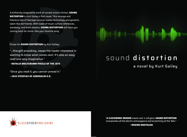
It’s probably obvious, since the black one is more finished, that we went with the black cover.
Go ahead and let me know what you think anyway. I’m totally cool with constructive criticism. What do you think? Quick, tell me before you read on, because I’m going to say what I think, and what I think about these two covers might influence your opinion.
So, in the process of making this book, we went through several covers. I had a line drawing that we tried to colorize and make look good enough to sale in public markets. No matter what we did to that line drawing, it never looked quite like a professional quality book cover. It was tragic. (Ha!)
After the line drawing fiasco, we started looking at photos that we could use. The problems with that were many, including the possibility of mistakenly using someone’s copyrighted photo. We didn’t, of course. The wise Vince Font of Glass Spider Publishing informed me that some photographers can be really snake-like about it. They put their pictures out on the infonet and then hide in the grass waiting for some unsuspecting person to use the photo—and then they bite! They’ll sue you for using a copyrighted work, even though the photo doesn’t indicate anywhere that it’s copyrighted material.
I even tried taking some of my own photos, but that didn’t work out either. It was catastrophic. (Haha!)
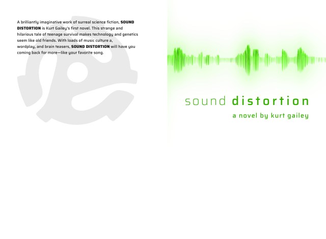
So, finally, (and Vince was probably ready to do me physical harm by then) we got the black cover. I asked to see it in white, because the black one gave me the initial impression of “surly”. Then when they sent me the white one, I passed both around to some people to see what they thought, and got some good and bad reviews on each. My impression of the white one, by the way, was “medical”. And this book isn’t a Robin Cook novel. It’s Sound Distortion, a psychedelic sci-fi novel about a teen who invents a method of speaking by using music as his voice. It’s amazing! (Aha!)
As you can tell, we went with the cover I nicknamed “surly”.
